Configure the Storefront Widget Button
Prerequisites
- The Avada Withdrawal Form app must be installed on your store.
- The Avada Withdrawal app embed should be active so the widget can show. See Add the Withdrawal Form & Button to Your Storefront.
The floating widget button is on by default - it shows automatically on your storefront after install. If you'd prefer a footer link instead of the button, use Contact us in the app and we'll switch it for you.
Open the General tab
Open Avada Withdrawal Form, go to the Widget & Form page, and stay on the General tab. Here you control where the widget shows and what happens when a customer clicks it.
- You'll see two cards: Country visibility at the top and Button behaviour below it.
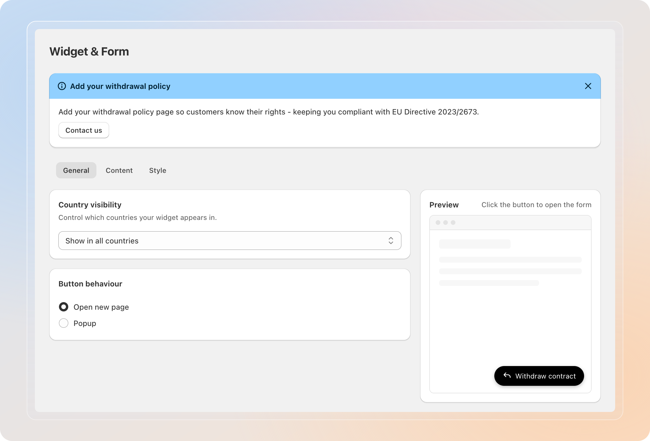
Set country visibility
The Country visibility card lets you decide which countries can see the widget on your storefront. This is helpful if your withdrawal form only applies to specific markets.
In the dropdown, choose one of:
| Option | What it does |
|---|---|
| Show in all countries | The widget appears for shoppers from every country. |
| Show only in selected countries | The widget appears only for shoppers from the countries you add. |
| Hide in selected countries | The widget is hidden from the countries you add, and shown everywhere else. |
If you pick a "selected countries" option, add each country you want to target.
Leave it on Show in all countries if you want the widget visible to every shopper, no matter where they are.
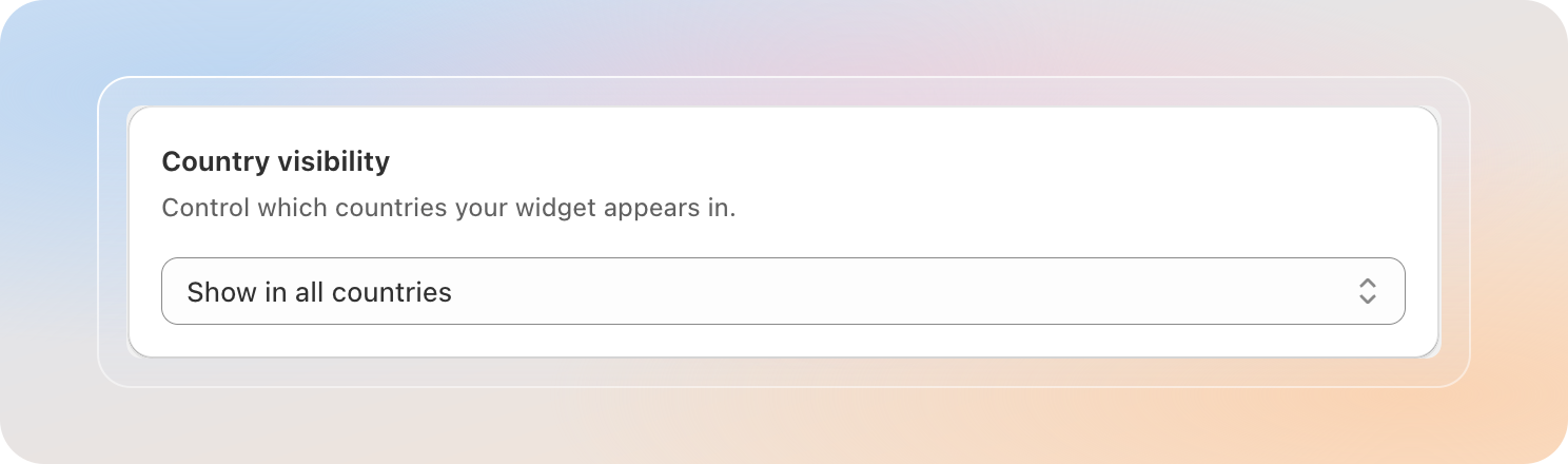
Choose the button behaviour
In the Button behaviour card, decide what happens when a customer clicks the widget button.
| Option | What it does |
|---|---|
| Open new page | Customers are taken to the withdrawal form page. |
| Popup | The withdrawal form opens in a popup on the current page. |
Set the button text
Open the Content tab and set the Button text - the label shown on the floating button.
- Enter your own text, or leave it to auto-translate by storefront language.
- Use the Language selector to set the button text per language.
Style the button
Switch to the Style tab to customize how the button looks.
- In the Colors section, under Widget button, set the Button color and Button text color.
- In the Button appearance section, pick an Icon (Return arrow, Document, or No icon), choose a Position (Bottom right, Bottom left, Top right, or Top left), and adjust the Corner radius.
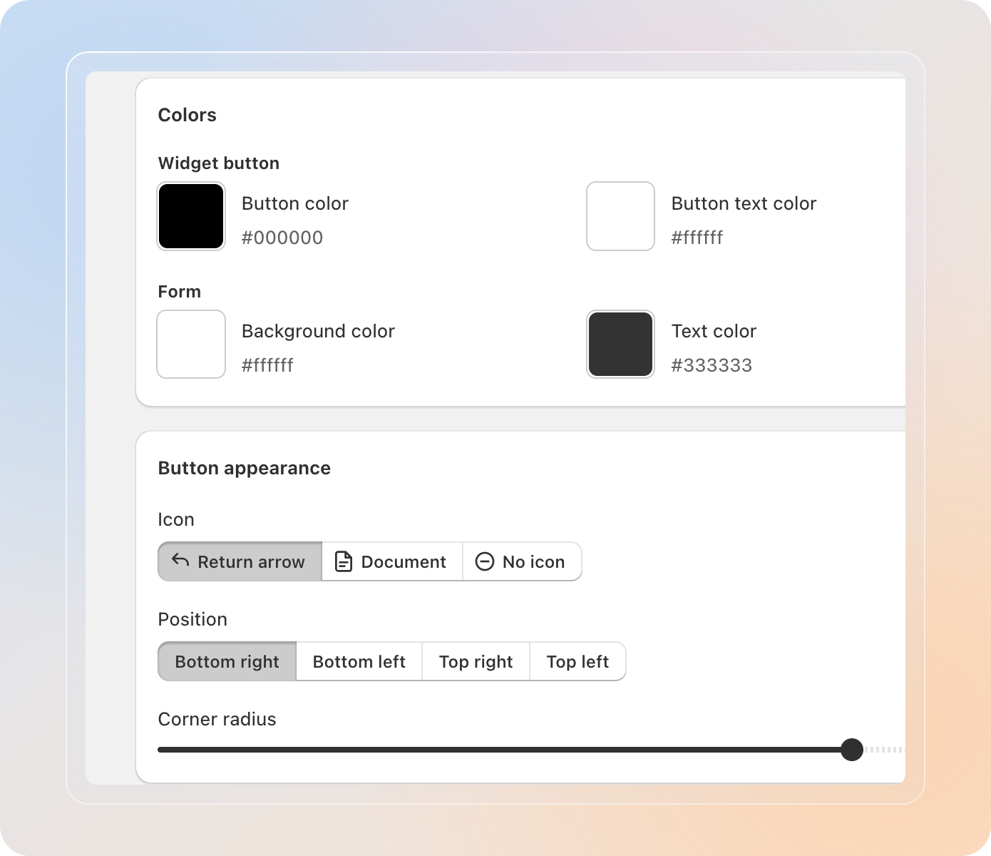
Use the Preview panel on the right to see the button update as you edit.
Save your widget
- Click Save to apply your changes.
- Visit your storefront to confirm the floating button appears in the chosen position and countries.
Tips
- The Country visibility and Button behaviour settings are both on the General tab, so you can manage the widget's shared behaviour in one place.
- Bottom right is the most familiar spot for shoppers, so it's a safe default.
- Custom button text is shown for every language, while the default text auto-translates per storefront language.
- If the widget doesn't appear, confirm the Avada Withdrawal app embed is on and saved, and check that the visitor's country is included in your Country visibility settings.
Related Articles
- Customize the Form's Appearance
- Add the Withdrawal Form & Button to Your Storefront
- Customize the Confirmation Email
And there you have it! You've successfully configured the storefront widget. Customers can now open the withdrawal form from a floating button anywhere on your store.
If you have any questions or run into any issues, don't hesitate to reach out. We're here to help!