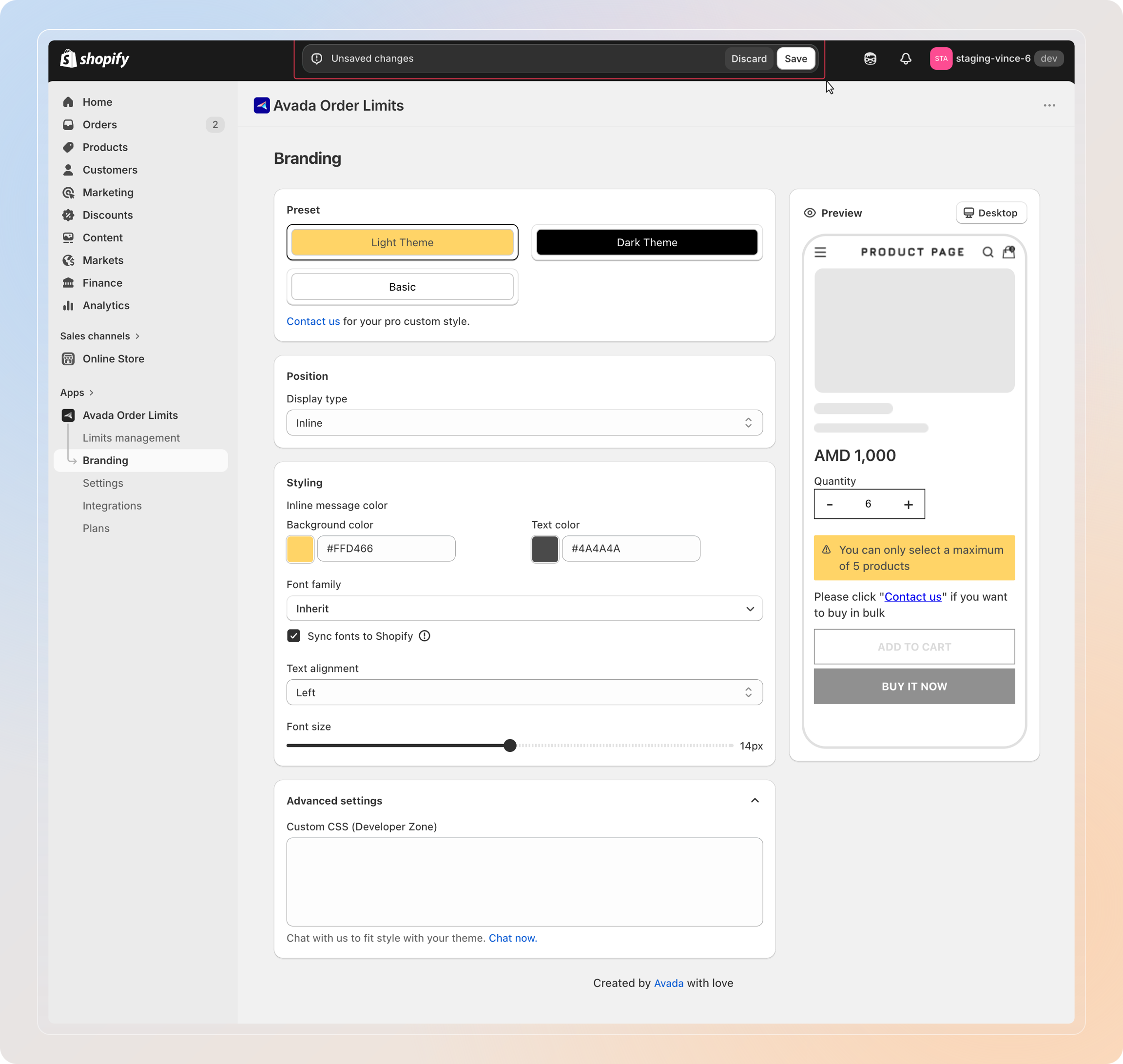
Branding
Requires: Free plan
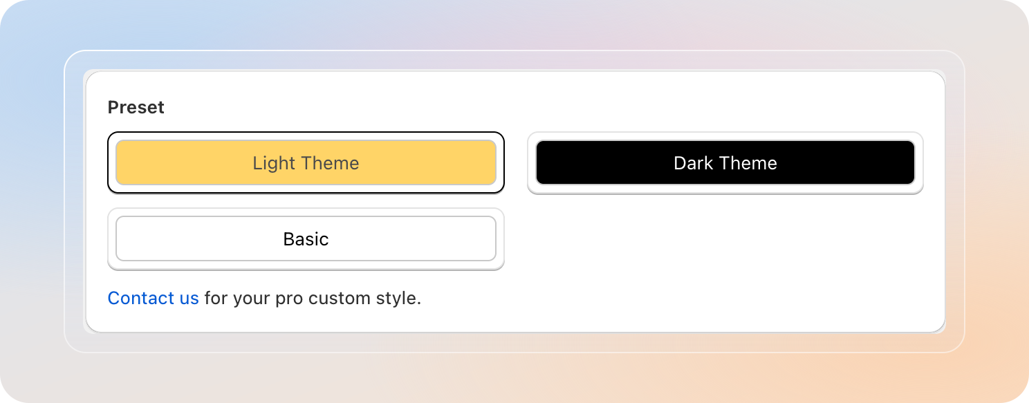
Step 1: Pick a Preset
Open the Preset section. Three theme cards are shown — click one to apply it to the notification.
| Theme | Look | Use when |
|---|---|---|
| Light Theme | Yellow background, dark text | Default — warm, friendly, high-contrast on most storefronts |
| Basic | White background, black text | Clean minimal look — matches almost any store theme |
| Dark Theme | Black background, white text | Bold contrast for dark-mode storefronts |
Picking a preset overwrites the color fields below — you can still tweak individual colors afterwards.
Tip: Want a custom palette that none of the three presets cover? Pick the closest preset, then adjust the color pickers in Step 3: Styling.
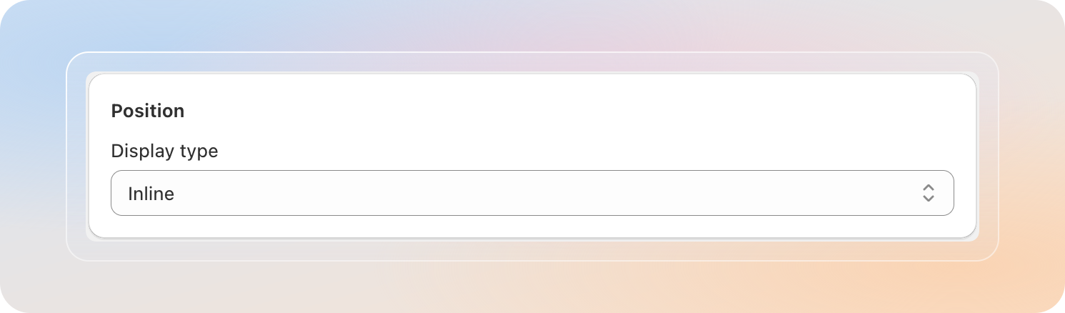
Step 2: Choose a Position
The Position section controls where and how the order limit notification appears on a product page.
Open the Display type dropdown and pick one of two values:
| Display type | Behavior |
|---|---|
| Inline | Embeds the notification directly inside the product page — sits as part of the page content, near the Add to cart area. |
| Popup | Shows the notification as a modal overlay on top of the page — higher visibility, harder to miss. |
If you pick Inline
On most Online Store 2.0 themes the inline notification is added automatically via an app block. If your theme doesn't support app blocks, a snippet field appears below the dropdown:
<div class="Avada-OrderLimit-Block__Container"></div>- Click the copy icon to copy the snippet.
- Paste it into your product page template at the exact position where the notification should render.
- If you can't add the snippet yourself, click Contact us — our team will help.
If you pick Popup
No theme edit is required — the popup is injected by the app and shown automatically when the order limit is hit.
Switching between Inline and Popup also switches which color fields are visible in the Styling section below.
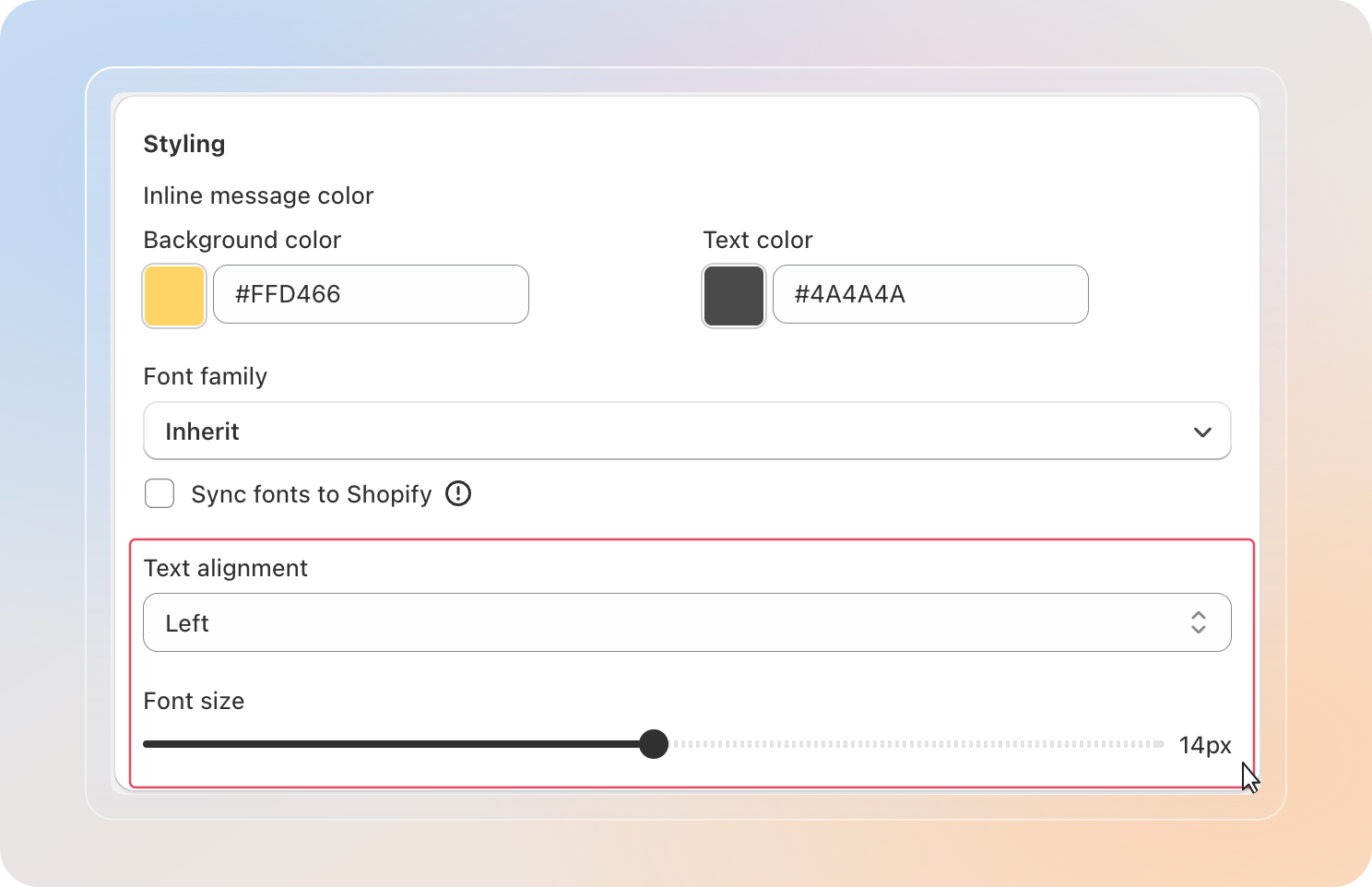
Step 3: Customize Styling
The Styling section bundles colors, font, alignment, and size into one place.
Colors
The color fields you see depend on the Display type you chose in Step 2.
For Inline (Inline message color):
| Field | What it controls |
|---|---|
| Background color | The fill color of the inline notification block |
| Text color | The color of the notification message text |
For Popup ("Contact us" button color):
| Field | What it controls |
|---|---|
| Button background color | The fill color of the Contact us button inside the popup |
| Button message color | The text color of the Contact us button label |
Click any color swatch to open the color picker — pick a swatch or paste a hex value, then close to apply.

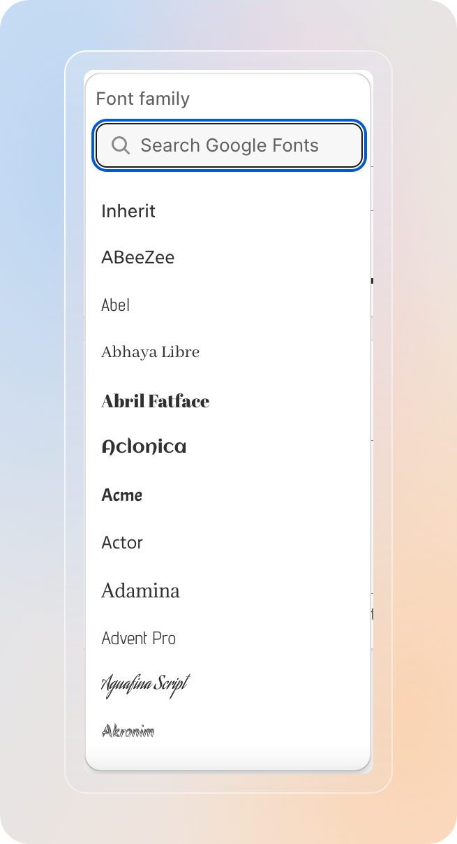
Font family
- Click the Font family picker to open the font browser.
- Type in the search box to filter — pick any Google Font from the list, or pick Inherit to use the storefront's existing font.
Sync fonts to Shopify
Just below the font picker is a checkbox: Sync fonts to Shopify.
- Unchecked (default): the selected font loads from the Google Fonts CDN on your storefront.
- Checked: the selected font is uploaded to your Shopify Files and the app loads it directly from your Shopify CDN — no third-party request.
Tip: Tick Sync fonts to Shopify if your store sells in the EU. Loading fonts directly from Shopify avoids sending visitor IPs to Google Fonts, which helps with GDPR compliance and improves Lighthouse performance scores.
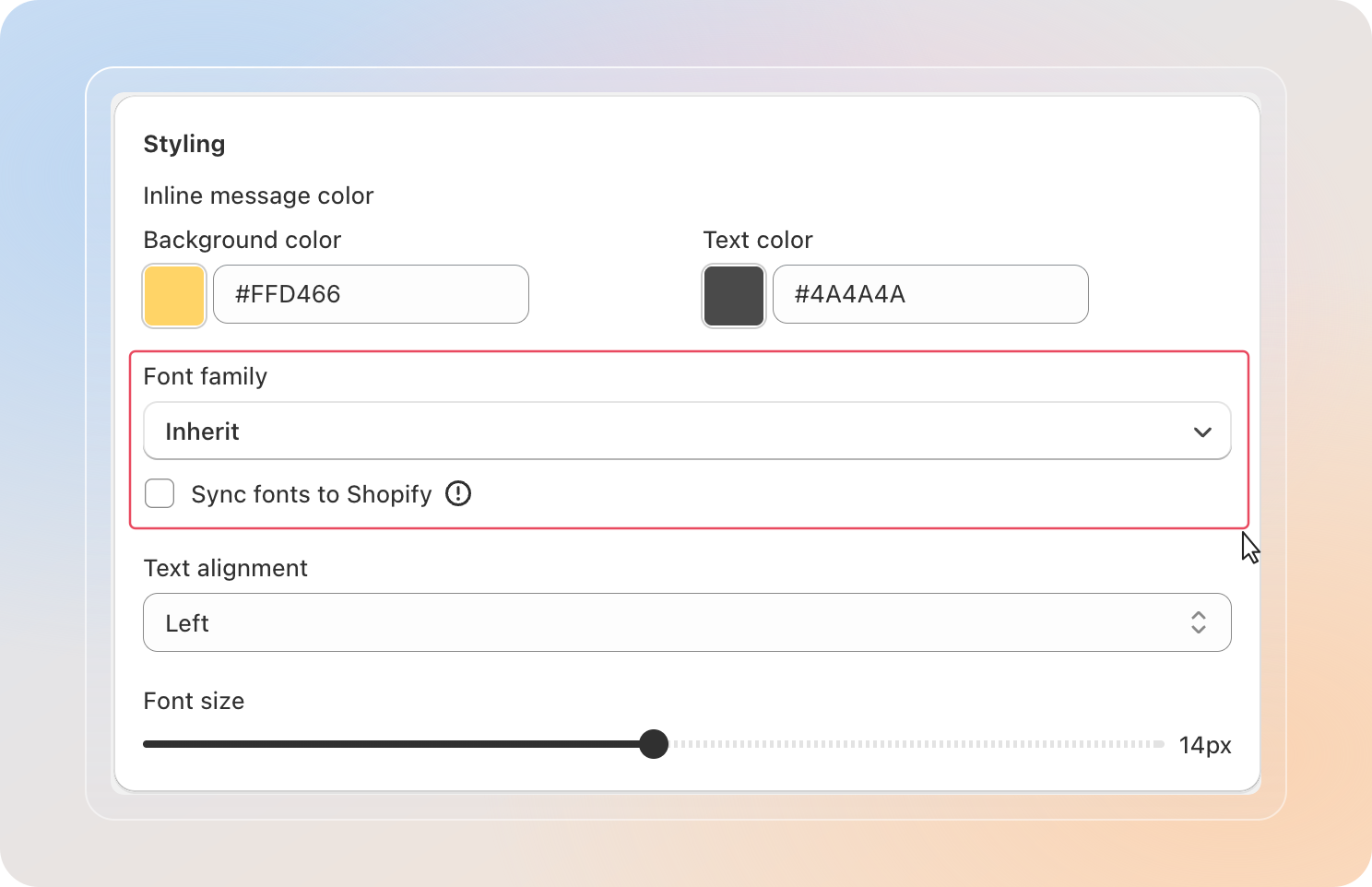
Text alignment
| Option | Effect |
|---|---|
| Left | Text aligns to the left edge |
| Center | Text is centered |
| Right | Text aligns to the right edge |
Font size
Drag the Font size slider between 8 px and 20 px. The number to the right of the slider shows the current value in pixels. The Preview panel updates as you drag.
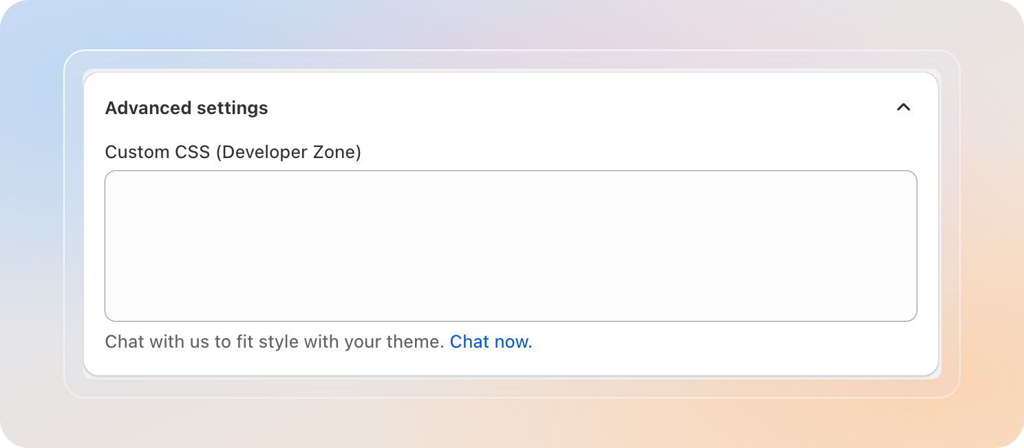
Step 4: Open Advanced Settings
Click the chevron next to Advanced settings at the bottom of the page to expand the section.
Custom CSS (Developer Zone)
A multi-line text field where developers can paste CSS rules to override the notification's default styling — useful for matching tight brand guidelines.
- Paste any valid CSS targeting the notification's classes.
- Changes apply immediately on Save — no theme edit needed.
- Use specific selectors (for example,
.Avada-OrderLimit-Block__Container) to keep the rules scoped to the notification.
Bad CSS can hide the notification or break its layout. Test on a draft theme or staging store before saving to production.
Step 5: Save and Verify
The Avada Order Limit admin uses Shopify's contextual save bar.
- Edit any field → the Save / Discard bar appears at the top of the page.
- Click Save — changes go live on your storefront within seconds.
- Click Discard — revert without saving.
To verify on your storefront:
- Open a product that has an active order limit rule.
- Trigger the limit (for example, add a quantity above the maximum to the cart).
- Confirm the notification appears with the colors, font, and position you configured.
Tips
- Start with a preset, then tweak. Picking Light Theme, Basic, or Dark Theme first gets you 80% of the way there in one click.
- Match font size to your product page. A 14-16 px notification usually reads well next to most theme body text.
- Use Sync fonts to Shopify for EU stores. Loading fonts from Shopify instead of Google Fonts removes an external request and helps with GDPR compliance.
- Inline vs Popup — pick based on urgency. Use Inline for soft guidance ("Max 5 per order") that lives quietly on the page. Use Popup for hard limits where you need to interrupt the customer.
- Keep an eye on the Preview. The right column updates live — you don't need to save to see how a color or font feels.